| Stron w wątku: [1 2] > | Suboptimal web design Autor wątku: Zea_Mays
|
|---|
Zea_Mays 
Włochy
Local time: 14:29
Członek ProZ.com
od 2009
angielski > niemiecki
+ ...
The site seems to switch to the "new" bad design - for example, the job page is now displayed only in this design which is hard to navigate.
The only good thing is that when hovering over a job, the related description is displayed (although in a popup without scrolling feature).
Also, if you don't select not to show closed jobs, they can't be spotted as closed in the view. It's a mess.
See how different the designs are:
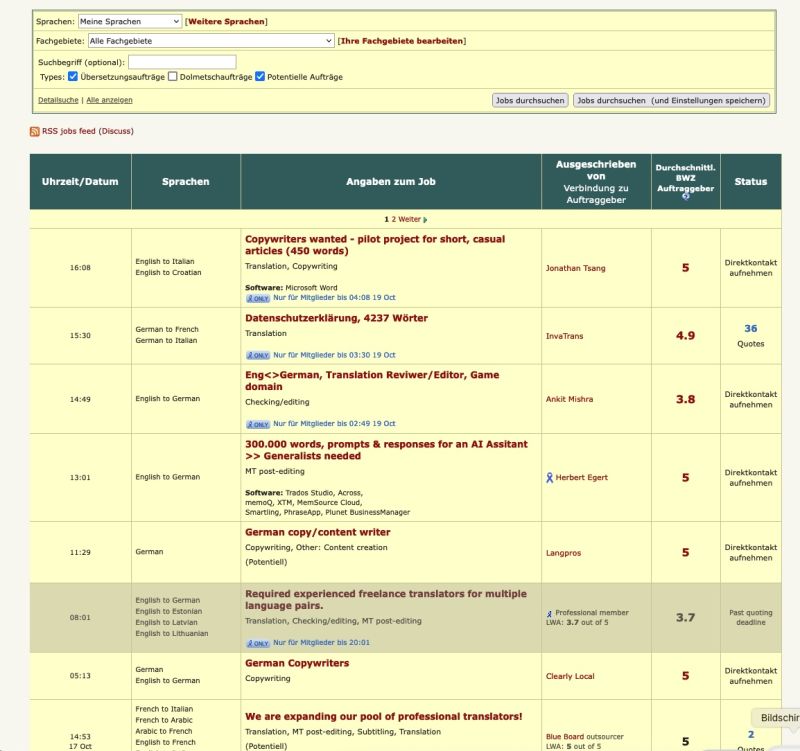
New design:
| | | |
Why make things simpler if you can complicate them?
| | | | ezpz
Local time: 13:29
Członek ProZ.com
od 2009
angielski > hiszpański
+ ...
| Zea_Mays
Włochy
Local time: 14:29
Członek ProZ.com
od 2009
angielski > niemiecki
+ ...
NOWY TEMAT | toggling no longer works | Jul 11 |
I didn't toggle, it is no longer possible afaik.
I have saved various screenshots in the past of bugs and bad design examples on ProZ, and the above is one of them.
| | |
|
|
|
Philip Lees
Grecja
Local time: 15:29
grecki > angielski
Maria Teresa Borges de Almeida wrote:
Why make things simpler if you can complicate them?
As I know from personal experience, there's a kind of mentality among some IT people that regards a well-functioning computer system as a challenge.
They can't help themselves: they have to tweak it, and upgrade it, and reformat it, and restructure the user interface, until it is no longer a well-functioning computer system.
Only then are they satisfied.
The modern incarnation of this mentality is to "optimise" a website for smartphone users, even when you know that most of your users are not viewing your site on a smartphone.
I, fortunately, am still viewing the "old" ProZ site, but I'm counting the days until this is no longer allowed.
Zea's experience seems to be a precursor of that.
| | | | Zea_Mays
Włochy
Local time: 14:29
Członek ProZ.com
od 2009
angielski > niemiecki
+ ...
NOWY TEMAT | aesthetics and usability is not everyone's cup of tea | Jul 12 |
Philip Lees wrote:
I, fortunately, am still viewing the "old" ProZ site, but I'm counting the days until this is no longer allowed.
I see the old web design too on most pages, just the job page is in the new design for now.
I actually don't understand the ProZ staff - why not building on the way better Connect page design? Why they prefer such a silly appearance?
| | | | Peter Motte
Belgia
Local time: 14:29
Członek ProZ.com
od 2009
angielski > niderlandzki
+ ...
| Different, but not better | Jul 12 |
This isn't the first bad web design I see.
The quality of web designs suffers in general. I often notice that essential elements are missing, like the arrows to slide the view of the window from left to right and vice versa of the view is too big to fit in the window.
| | | | | Can you tell us a bit more about why you preferred the classic search? | Jul 12 |
Hi, everyone,
I hope you are having a good week! Thank you so much for your feedback here.
When we release updates, we always try to allow some time in which the classic and new versions of a feature coexist, just like these two views coexisted for over five years. But, in order to be able to work on necessary updates and new features, we need to stop providing maintenance to older, outdated sections.
We are currently working on a new and modernized ProZ... See more Hi, everyone,
I hope you are having a good week! Thank you so much for your feedback here.
When we release updates, we always try to allow some time in which the classic and new versions of a feature coexist, just like these two views coexisted for over five years. But, in order to be able to work on necessary updates and new features, we need to stop providing maintenance to older, outdated sections.
We are currently working on a new and modernized ProZ.com experience, and one of our priorities is to update the "Browse jobs" section, and we want the modernized version to be as complete and easy to use as possible.
To help us make sure that the new Jobs experience really meets your needs, I would like to ask everyone why you preferred the classic jobs search —and what you prefer about the new one!
You have mentioned that "closed" jobs being clearly marked in a darker shade was a big "pro" in the classic view, but that you like the quick preview of the job's description in the new version.
Are there any other things that stand out to you as benefits or drawbacks in either version?
Thank you in advance for any comments you are willing to share! I look forward to hearing from you.
Have a lovely end to your week! ▲ Collapse
| | |
|
|
|
Philip Lees
Grecja
Local time: 15:29
grecki > angielski
Andrea Capuselli wrote:
We are currently working on a new and modernized ProZ.com **experience**, and one of our priorities is to update the "Browse jobs" section, and we want the modernized version to be as complete and easy to use as possible.
To help us make sure that the new Jobs **experience** really meets your needs, I would like to ask everyone why you preferred the classic jobs search —and what you prefer about the new one!
I can't comment specifically about the "Browse jobs" section, because I don't use it. However, regarding the ProZ website in general, the "old" design is straightforward, visually attractive, and easy to navigate. When I looked at the new design I found it to be none of those things. So I went back to the old one.
Why mess with something that already works well?
And one question: why do you say "experience" (twice), when you mean "website" or "web page"?
| | | |
Experience as in «experiencing difficulties»
[Edited at 2024-07-13 09:52 GMT]
| | | | Zea_Mays
Włochy
Local time: 14:29
Członek ProZ.com
od 2009
angielski > niemiecki
+ ...
NOWY TEMAT
Andrea Capuselli wrote:
You have mentioned that "closed" jobs being clearly marked in a darker shade was a big "pro" in the classic view, butt hat you like the quick preview of the job's description in the new version.
Are there any other things that stand out to you as benefits or drawbacks in either version?
Thank you in advance for any comments you are willing to share! I look forward to hearing from you.
Have a lovely end to your week!
Hi Andrea, thank you for taking the time to enter the discussion.
Well, the issues of the new intended version have been highlighted very often in these forums.
Here's an example: https://www.proz.com/forum/prozcom_bugs/367153-hello_bugs_n.html#3046145
.
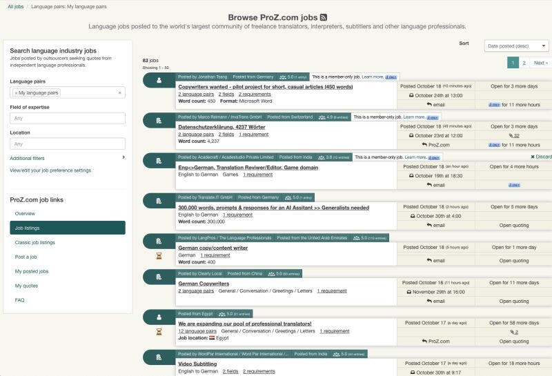
design bugs job page in the "less-old" and less user friendly design: you can't spot at a glance the language pairs and which jobs are closed or open. There's also too much text in tiny boxes, and the symbols on the left require too much space (are they of any help at all?). The old design is still way more intuitive and clean. . 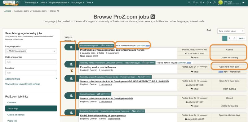
.
Other examples I'd add:
- the search panel (left side now) could be put in a hamburger menu or in a pop out menu.
- the green bars above the single jobs have different length and therefore make a messy, uneven visual effect, and they look like progress bars.
- what is the empty space of variable size under the green bars for?
- lack of information hierarchy: the green bars create visual top level hierarchy but contain information of secondary importance (job title is the most important information instead)
- "Posted from" is not always displayed on the same place
- UI is in English!
- the header part ("Browse jobs") does not use space efficiently
- the boxes on the right (2 columns) do not use space efficiently
- too much underlined text
- info should be as short, little and useful as possible
The old design is actually old-fashioned, an update is surely a good idea, but User Experience (UX) should always have priority.
If you compare the old and the new design in my first post, you see at a glance, without reading, which one is more clear, balanced, intuitive and user friendly.
Other notes on old/new design can be found here:
https://www.proz.com/forum/prozcom_suggestions/363503-suggestions_for_"new"_kudoz_interface.html
Philip Lees asked:
WTF? experience
Buzzword in 3rd millennium Newspeak that can mean anything, occurs very often in recent times. It has become one of my most detested English words.
[Bearbeitet am 2024-07-13 10:54 GMT]
| | | |
Thanks for your contribution to this thread. I have two words to describe the new “experience”: confusing and unclear! I may be wrong, but it seems to me that Proz.com doesn't know its audience and hasn't listened to what we've been saying over the years...
| | |
|
|
|
Zea_Mays
Włochy
Local time: 14:29
Członek ProZ.com
od 2009
angielski > niemiecki
+ ...
NOWY TEMAT
From the thread linked above; the display may have been changed meanwhile, but I think the notes are still valid:
Zea_Mays wrote: Now with the Homepage, old vs new UI. I added comments on some elements, just take them as my personal opinions based on my experience with web design. >>> Note where the switch-to-new/back-to-old-ui-option is located on the pages and how it is formatted! (red circle) Important but almost hidden options are part of DARK PATTERNS. HOMEPAGE - old UI 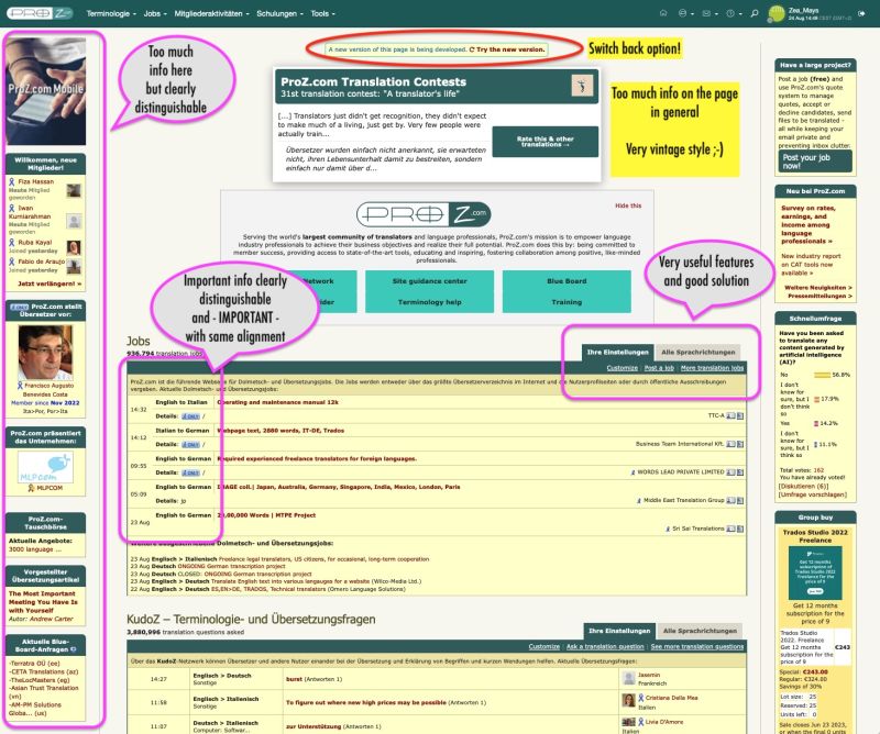 HOMEPAGE - new UI HOMEPAGE - new UI 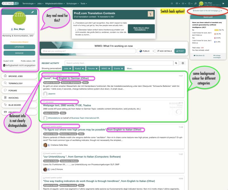
| | | | kecen guo
Australia
Local time: 21:59
angielski > chiński
+ ...
| need good UI/UX designer | Jul 13 |
I find the website has become more confusing compared to 4 years ago as well.
We definitely need a good UI/UX designer.
| | | | Andrejs Gorbunovs
Łotwa
Local time: 15:29
Członek ProZ.com
od 2013
angielski > łotewski
+ ...
| Different jobs showing | Jul 14 |
This is the classic IT design issue.
The redesign is done by a person who is not a frequent visitor of the Jobs page.
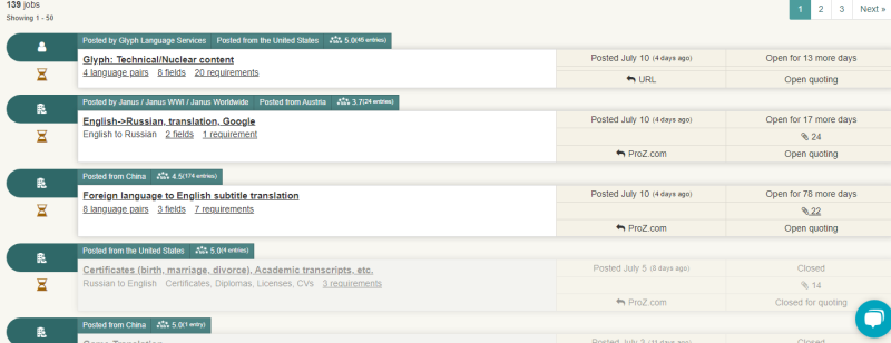
Also, the new design is not showing the same jobs as the old design:
If this is because of some settings that I did not change and was not aware of, it is even worse, since it means that I lost opportunity to apply to the jobs posted after 10th of July without even knowing.
Great way for me to loose job opportunities and for Proz.com to loos... See more This is the classic IT design issue.
The redesign is done by a person who is not a frequent visitor of the Jobs page.
Also, the new design is not showing the same jobs as the old design:
If this is because of some settings that I did not change and was not aware of, it is even worse, since it means that I lost opportunity to apply to the jobs posted after 10th of July without even knowing.
Great way for me to loose job opportunities and for Proz.com to loose paying customers.
1. New design jobs:
2. Old design jobs:
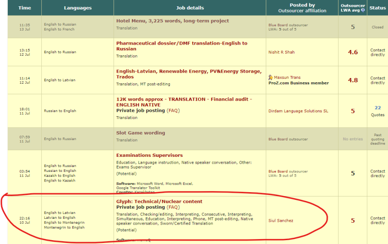
The old design has great visiblity, while the new design is murky and uninformative. ▲ Collapse
| | | | | Stron w wątku: [1 2] > | To report site rules violations or get help, contact a site moderator: You can also contact site staff by submitting a support request » Suboptimal web design | Pastey | Your smart companion app
Pastey is an innovative desktop application that bridges the gap between human expertise and artificial intelligence. With intuitive keyboard shortcuts, Pastey transforms your source text into AI-powered draft translations.
Find out more » |
| | Wordfast Pro | Translation Memory Software for Any Platform
Exclusive discount for ProZ.com users!
Save over 13% when purchasing Wordfast Pro through ProZ.com. Wordfast is the world's #1 provider of platform-independent Translation Memory software. Consistently ranked the most user-friendly and highest value
Buy now! » |
|
| | | | X Sign in to your ProZ.com account... | | | | | |